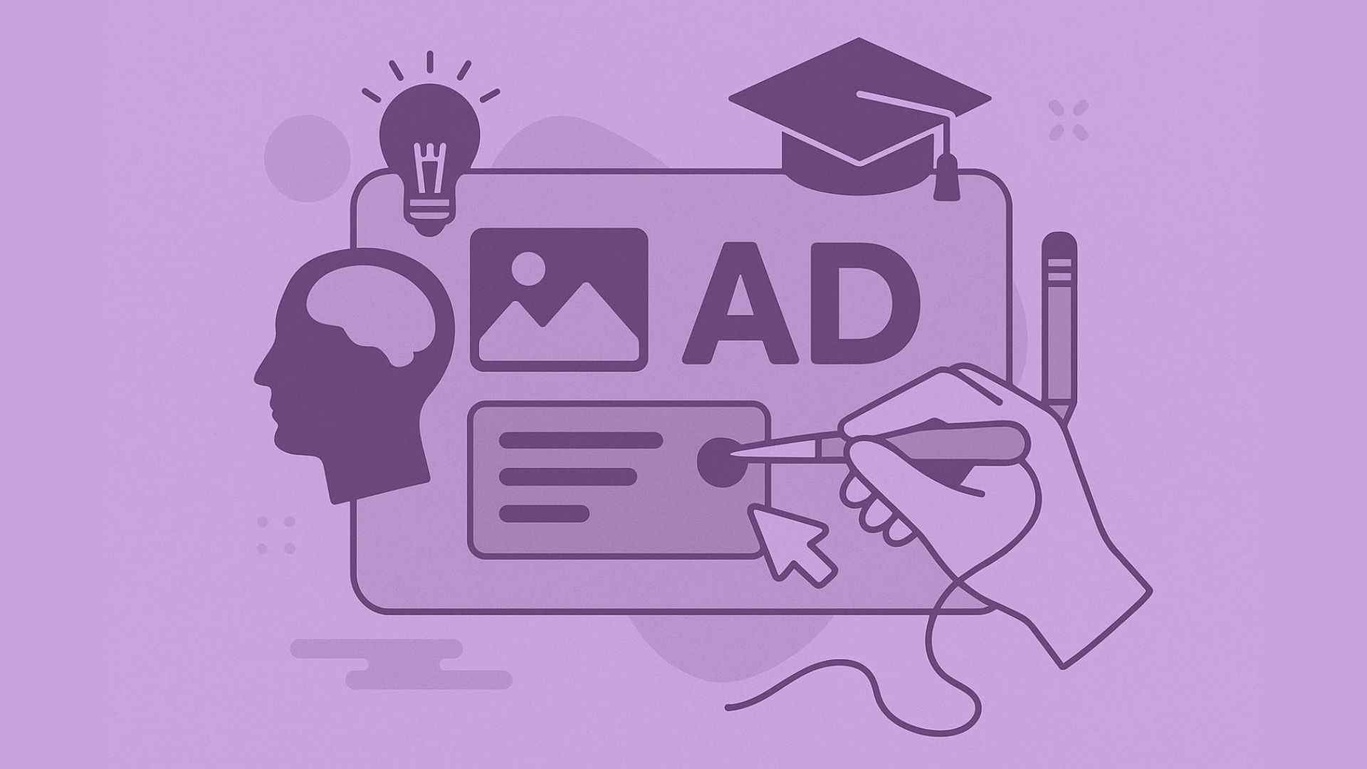
Anatomy of Effective Creative Ads in Higher Ed
Since launching NextGrad in 2019, we’ve partnered with a wide range of institutions and organizations, including 2-year colleges and public health departments, to 4-year universities and military recruiters. And across that landscape, one trend has become painfully clear: a lot of higher education ads look the same.
Most ads follow the same formula: logo, ranking, student or campus photo, a .edu link, and that’s about it. But students today deserve our best ideas. They’re savvier, more skeptical, and far more likely to scroll past creative that doesn’t feel relevant or compelling.
Meanwhile, consumer brands are evolving rapidly, developing creative that not only catches attention but speaks directly to what their audience wants to hear. So… what if higher ed followed that lead? What if we started from scratch?
Let’s Talk About What’s Not Working
Generic content that has nearly identical visual and message templates between institutions makes it easy for prospective students to potentially confuse your brand or message with another institution. Think about how many black and gold brand colors are in our space. Most of the time, the only thing that distinguishes one school from another is the logo – and sometimes, those logos are too small or not recognizable enough.
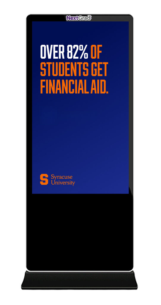
Messaging on these ads also often speaks to internal stakeholders and what they deem important (highlighting specific rankings, for example) rather than what prospective students are actually concerned with. Students today want to know about career outcomes, financial support, and belonging, amongst other things.
So, What Does Work?
Good creative:
- Speaks to specific motivations and pain points
- Uses copy that resonates with the target audience
- Feels native to the platform it’s placed on
- Aligns messaging and design with campaign goals
For example, if you’re targeting first-generation students, they’re likely prioritizing affordability and career outcomes. Speak to that directly and clearly. It starts with understanding who you’re talking to. Creative designed for adult learners shouldn’t be recycled for high school students viewing NextGrad hallway screens. These audiences care about very different things, and using the same messaging for both only reinforces the idea that “if you market to everyone, you’re marketing to no one.”
Design for the Media, Not the Other Way Around
The medium matters more than ever:
- OOH (like NextGrad screens): Bold visuals, minimal copy, and messages that stick in 3 seconds or less.
- Social Media (TikTok, Instagram, Reels): Authentic, story-driven creative that looks and feels native to the feed.
- Streaming (CTV, YouTube): Engaging :30 spots that deliver your full message clearly and memorably.
Trying to force a one-size-fits-all ad across every channel just doesn’t work anymore.
Start by Auditing Your Current Creative
Here are some questions to help guide your review:
- If the logo were removed, would anyone know it was ours?
- What’s the primary goal of this ad? Awareness? Inquiries? Applications?
- Does that goal align with the platform we’re using? (Ex: Awareness = OOH, Conversions = Search/Social)
- Who is this ad actually speaking to? High schoolers? Adult learners? Parents?
- Are we talking about what we care about, or what they care about?
Bottom Line
You can’t create great ads without truly understanding your audience. If you’re not sure what your students want or need, consider running a quick survey, focus group, or audit of enrollment data to build stronger personas.
The more relevant and personalized your creative is, the more likely it is to capture attention and convert.
Want to get your ads in front of the right audience with messaging that actually works?
Let’s talk—contact us today.